The Evolution of Big Bash Cricket
This page describes my study of Big Bash cricket using data sourced from cricsheet.org.
I used ball-by-ball data from 414 games to study how innings progress from start to finish, as well as how Big Bash cricket has changed over its 10 seasons.
Method
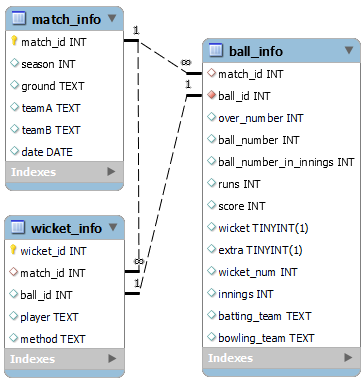
I used three tools in this project: Python, MySQL, and Tableau. I used Python to parse the yaml files from CricSheet, format the information, and then insert it into a MySQL database. The database has three tables, one for information about each match, one for information about each ball, and one for information about each wicket. The database layout and field names are shown to the right.
I used MySQL workbench to directly query the database for exploratory analysis, and then rewrite useful and interesting queries into a Python script. The Python script extracted, processed, and saved output data in csv files which I imported into Tableau to create the interactive dashboard below.
Trends over BBL seasons
Some of the interesting findings from this project are shown in the Tableau dashboard embedded below. Data are grouped by season and over number so that comparisons can be made, and you can click on a datapoint to isolate individual seasons. You can also view the dashboard directly at Tableau Public. Discussion is given below the dashboard.
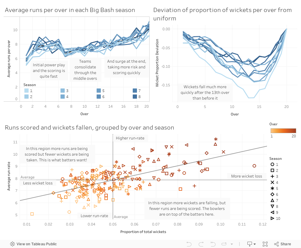
The top-left panel shows average run-rate per over, separated by season. It is quite clear that across all seasons, teams start their innings quickly, then slow down after 4-6 overs and gradually build up momentum to finish with some high-scoring overs. The large drop in scoring after the first few overs is due to the end of the powerplay, a period at the start of the innings where fielding positions are restricted so runs are easier to score. A few specific features can be seen from this plot:
- For Season 10, the initial powerplay was reduced from six overs to four. The effect can be seen clearly by isolating the Season 10 curve, where the drop in scoring rate happens after the fourth over.
- Scoring was slower in the first few seasons (lighter lines), particularly at the start and end of the innings.
The top-right panel shows the cumulative proportion of wickets that fell after each over, measured against the average rate. To explain this calculation, consider Season 1, where 10 wickets fell in the first over of an innings, and a total of 345 wickets fell. The wicket proportion for the first over is therefore 10/345=0.0290. The average rate would have teams losing an equal number of wickets each over, with wicket proportion 1/20=0.05 in every over. The first over in Season 1 therefore has a wicket proportion 0.021 lower than the average rate. A decreasing value on the plot means teams are losing wickets at less than the average rate (conserving their wickets), while an increasing value means they are losing wickets more quickly. The trend is quite clear, and once again some interesting variations can be seen:
- In Season 1, teams were more protective of their wickets early in the innings, with wickets falling at a significantly slower rate. Their innings' were less balanced---taking little risk and scoring slowly at first then losing many wickets late, presumably while taking lots of risk to score very quickly.
- In later seasons, teams seem to have become comfortable losing wickets at a faster rate early in their innings. Despite this, it is still around the same point in the innings, roughly the 13th over, where they start to dramatically increase risk levels.
The bottom panel compares run-rate against wicket proportion for each over in each season. The symbols darken with increasing over number and are a different shape for each season. This is a particularly interesting plot because it helps visualise the risk/reward tradeoff mentioned previously. Scoring more runs in an over (moving up on the plot) correlates with an increased risk of dismissal (moving to the right on the plot). Some of the trends identified previously can be seen here as well, for example the darker symbols to the rop-right of the plot (corresponding to the late overs) show where teams take big risks to score runs quickly.
You can select individual seasons to get a closer look at the data, by clicking on a datapoint or in the legend. In later seasons, the maximum wicket proportions actually fall while the maximum run-rates stay fairly stable. This shows batters have evolved their approach to more safely score runs quickly at the end of the innings. Put another way, they get more value for taking risk.
The way Big Bash cricket is played has definitely changed over the seasons. Batters have adapted to the extremely short format and have learned to place less value on their wickets and more value on consistent scoring through the innings. They are also able to score runs more quickly at the end of the innings without losing wickets so quickly, suggesting improved strategies and shot selection.